这篇文章将简述使用CSS3的border-radius来画圆、半圆和四分之一圆,并如何利用它们。
如何使用border-radius属性
下面是border-radius属性最基本的使用方法。
.round {
border-radius: 5px; /* 所有角都使用半径为5px的圆角,此属性为CSS3标准属性 */
-moz-border-radius: 5px; /* Mozilla浏览器的私有属性 */
-webkit-border-radius: 5px; /* Webkit浏览器的私有属性 */
border-radius: 5px 4px 3px 2px; /* 四个半径值分别是左上角、右上角、右下角和左下角 */
}
关于在IE里怎么实现圆角,可以看《Excellent Article Which Included Ways to Achieve Rounded Corners in IE》这篇文章。
1.用border-radius画圆
实心圆

#circle {
width: 200px;
height: 200px;
background-color: #a72525;
-webkit-border-radius: 100px;
}
空心圆
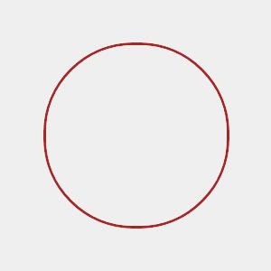
#circle {
width: 200px;
height: 200px;
background-color: #efefef; /* Can be set to transparent */
border: 3px #a72525 solid;
-webkit-border-radius: 100px;
}
虚线圆
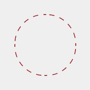
width: 200px;
height: 200px;
background-color: #efefef; /* Can be set to transparent */
border: 3px #a72525 dashed;
-webkit-border-radius: 100px 100px 100px 100px;
}
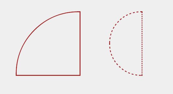
2.半圆和四分之一圆
半圆

#quartercircle {
width: 200px;
height: 200px;
background-color: #a72525;
-webkit-border-radius: 200px 0 0 0;
}
四分之一圆

#quartercircle {
width: 200px;
height: 200px;
background-color: #a72525;
-webkit-border-radius: 200px 0 0 0;
}
更多玩法
看了这么多实例后,你完全可以自己创造更多玩法,如:


0 条评论。